“The Annotated Turing” Typographic Triumph
March 27, 2008
New York, N.Y.
From its earliest conception, I knew that my forthcoming book The Annotated Turing would contain the complete text of Alan Turing's 36-page paper (and 3-page correction) "On Computable Numbers, with an Application to the Entscheidungsproblem," originally published in the Proceedings of the London Mathematical Society in 1936 and 1937.
There are basically two ways you can reproduce a 1936 paper in a modern book: You can scan the original paper and essentially treat it like a bitmap, or you can entirely re-set the paper as if it were any other text.
The first approach is used in The Collected Works of A. M. Turing and Martin Davis's 1965 book The Undecidable: Basic Papers on Undecidable Propositions, Unsolvable Problems and Computable Functions. In theory I like this approach because the reader is actually encountering the original paper as it looked 70 years ago. However, depending on the condition of the original source, the result can look a bit gritty, and you can even get some broken characters. Perhaps the best scan I've seen of Turing's paper is this one and it's certainly not perfect.
The second approach (re-setting the paper) is used in B. Jack Copeland's book The Essential Turing and also in this online PDF version. The paper becomes very readable (except in the online PDF version) but it doesn't look quite "real." It doesn't stand out as an object foreign to the modern parts of the book. The possibility also exists that new errors will be introduced when it's re-set.
For The Annotated Turing I had another major consideration. The book contains not only Turing's paper but my commentary and explanations interspersed with the paper. Turing made use of a German gothic font and an unusual script font in his paper. To minimize confusion, I would need to use those same fonts in my commentary and annotations, and I suspected it would be quite difficult to match the fonts exactly.
For those reasons, I wanted Turing's paper to be re-set in my book, but I also wanted it to look as close as possible to the original published version. I struggled with this problem in Microsoft Word (as I have described) so I was well familiar with the difficulties involved. Besides the multiple fonts, the paper contains a lot of strange tables and mathematical formulas with subscripted subscripts.
I discussed these issues at length with the book's Development Editor at Wiley, and he agreed that the paper should be re-set. I told him "I want to be able to proof-read the re-set paper by printing it on transparency film and putting it on top of the original version." He was amused by this concept, and of course neither of us expected the scheme to work. Small differences in type size and line spacing make an exact match impossible.
But I had to try. When I recently received a PDF of the re-set paper to review, I printed it on transparency film, and positioned each page of film on top of a normal printout of the original paper. I discovered that I could proof-read the pages not by an exact positioning, but so that lines of text alternated, like this:
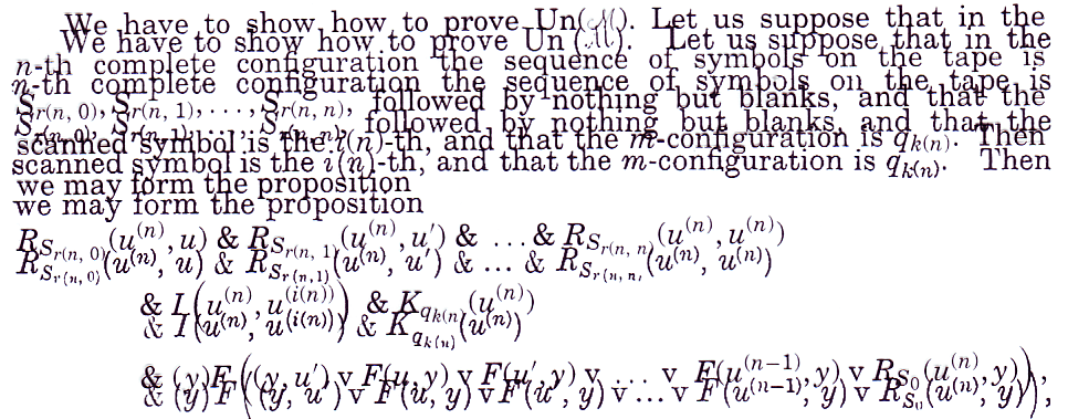
That's a 200-DPI scan with the re-set version printed on transparency film oriented slightly above a printout of the original paper. By sliding the transparency around on the original, I was able to compare the two versions quite easily.
As you can see, the two fonts aren't precisely the same, but they're both variants of Century Schoolbook. I think that people familiar with the paper from The Collected Works or Davis's The Undecidable will pause a bit when encountering the paper in my book and ask "Is it real? Or is it re-set?" and not be able to decide for sure right away.
That's precisely the effect I wanted.
|
Coming June 10, 2008! Available for Pre-Ordering |
||
| Wiley | Amazon US | Barnes & Noble | |
| Amazon Canada | Amazon UK | Amazon Deutsch | |
| Amazon Français | Amazon Japan | Blackwell | |